The sun is out, the drinks are (mostly) free, and hundreds of Issey Miyake-wearing fellas are criss-crossing the city: Milan Design Week is so back. This year’s edition saw over 500,000 people come to the capital of design to stand in lines and see cool stuff. I loved every second of it. It’s impossible to see everything, but having the Archived Spaces events map and friends in town helped me build out a guide for myself. While I wasn’t able to see the 1000+ event and shows, I still came out of Milan Design Week noticing a few key trends.
Craftsmanship and Heritage: A Milan Design Week Staple
Most fashion-adjacent exhibitions this year explored themes of heritage as inspiration: be it Gucci’s Renaissance-style tapestries telling the story of the house through twelve chapters, C.P. Company x Alessi’s exploration of process development through interweaving histories, Issey Miyake and Bottega Veneta in-store installations (with Ensemble Studio and Kwang Ho Lee respectively) showcasing their material philosophies, or in a more abstract level Jil Sander’s (beautiful!) reference library. All of these projects were great in different ways, and while each could fill its own review, Loro Piana was, for me, head and shoulders above the rest.
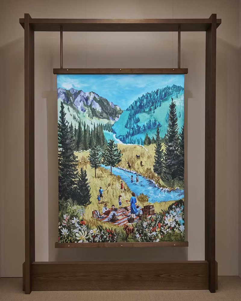
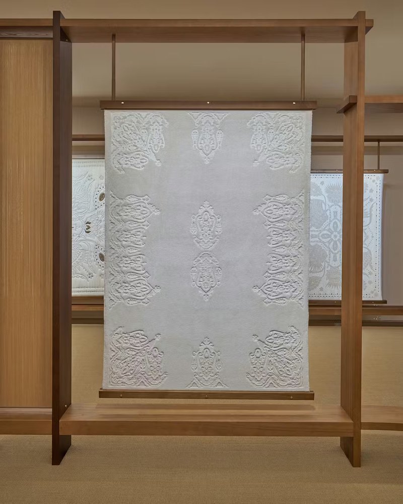
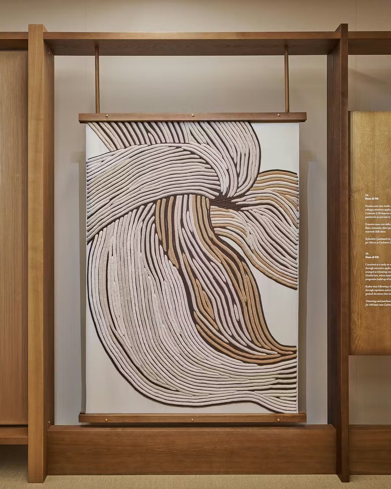
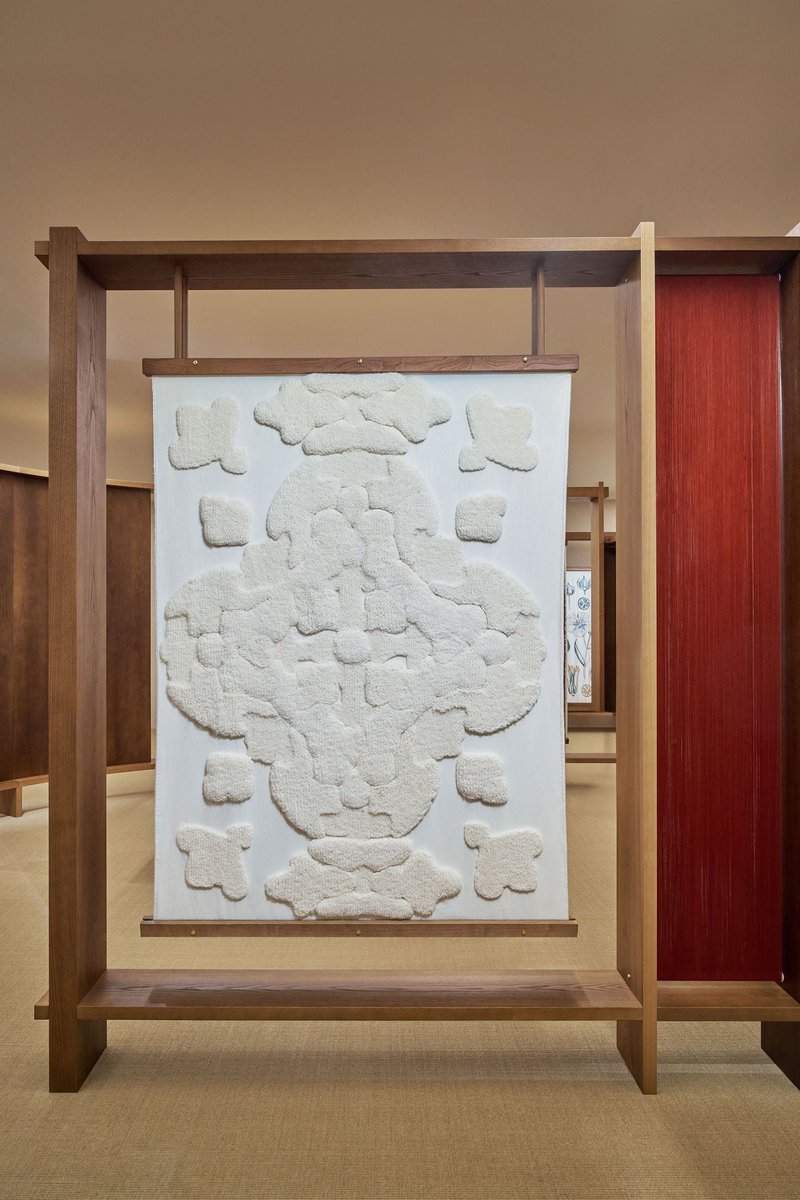
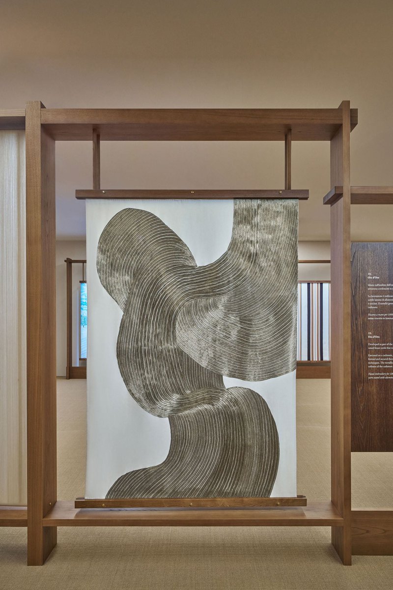
Loro Piana was incredible in a really low-key way, which… given it’s Loro Piana, seems apt. Through a series of cashmere canvases, they showcased the brand's heritage, material exploration, and the highest level of craftsmanship. The show was composed of 20-or-so large canvases that I’d guess were about 180cm by 100cm if I was any good at guessing. Alongside the name and a technical description of each piece, they listed how many hours it took to complete, with some pieces literally having taken thousands of hours. This sounds excessive at first glance, but as you sat with them you could tell not a second of those hours was wasted. It was craft as art to the point of sublimation. Genuinely almost made me cry.
And yet, it never felt self-indulgent or self-congratulatory. (This is high praise during Milan Design Week.) Restraint made the material exploration and development actually be appreciable; without the fireworks, a calming and reflective environment invited you to take time to look at what was in front of you. Once you did, like a magic-eye poster, the true beauty within each piece revealed itself ten times over.
There was also something to be said for how intelligently the exhibition was structured, as what was being depicted from the first canvas to the last became progressively more abstract. You start from a screen-printed scene of the founding family's region in spring, moving through pattern exploration (paisley and plaid), and ending with an abstract wave of silver crafted from hand-embroidered beads painstakingly put onto the finest cashmere. In other words, you entered through the figurative, and as you moved through the exhibition the material enveloped you to where you no longer needed narrative elements to understand it. In this, you got a greater sense for the brand’s heritage; it’s not about a specific name or place, it’s about the love of craft and excellence.
Haptic Environments
A lot of installations this year weren’t really trying to show you something, but rather trying to put you inside something. That sounds obvious, but it’s actually a pretty different attitude from the usual “immersive” stuff you get during Milan Design Week. Normally immersion just means scale + lighting + something vaguely cinematic. You walk in, you get the point in five seconds, you take a picture, you leave.
This year, the better examples didn’t really give you that moment. You entered them, and then, through sound, through light, through the way materials shaped how you moved, if you earnestly engaged with them, they actually had an effect on you.
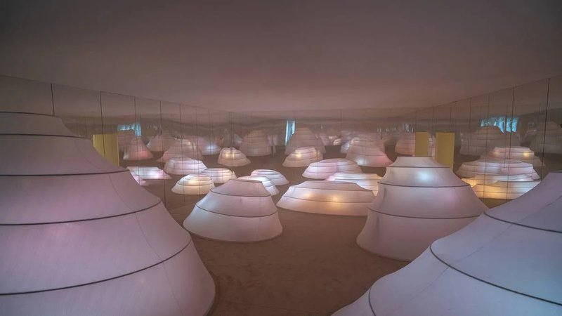
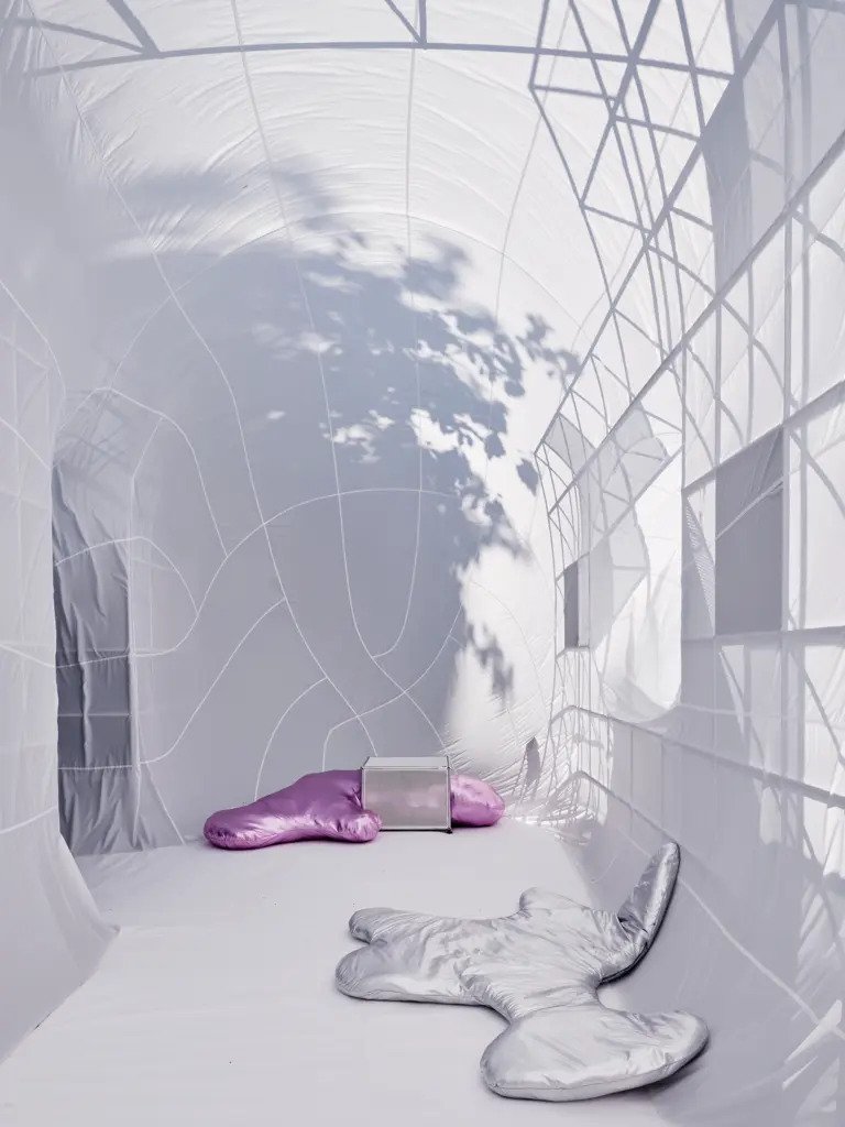
The Objects of Common Interest installation at Alcova was the first one I saw, and it was an interesting first experience. It relied on a central object of emptiness: you’d take your shoes off and enter this totally white room enclosed by plastic sheets. Nothing dramatic happened, but your perception kept adjusting in response to this totally sterile white space.
It wasn’t about looking at something. It was about the slight disoriention of nothingness.
A lot of installations foregrounded sound this year, too. I saw a recurring theme of these cathedral-like speaker setups – tall, sculptural, placed in a way that made them feel monumental – as well as more minimal listening rooms .
At Deoron, of course, the central speakers by New Fidelity, where Archived Dreams hosted listening sessions. At Convey too, in the sound rooms by Fidivi and Western Acoustics, the audio became an immersive, embodied experience. Low frequencies would sit in your chest, higher ones would move across the room, and suddenly you became very aware of where you were sitting. The lack of visual stimuli heightened your sense of hearing and your sense of touch, making every movement register as a hugshift.
Other notable mentions are Sensory Landscapes by Mohd and Elle Decor, Kia’s Resonance of Opposites (there were a few good car ones this year, actually), USM’s Renaissance of the Real, and to a lesser degree Asic’s Kinetic Playscape, where it wasn’t really about seeing a product per se, but about stepping into an emotional landscape that made you feel more embodied.

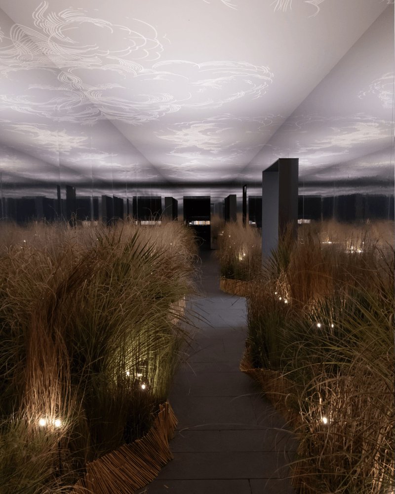
What ties all of these together isn’t that they’re “immersive,” but that they operate on a different timescale. They don’t give you a peak. There’s no climax, no single image that resolves the experience. Instead, they build gradually, almost imperceptibly, engaging all your senses until you realise you lost your sense of time.
Material Escape
On the other end of the spectrum, there was a whole set of projects that felt like they were actively trying to break away from this kind of control.
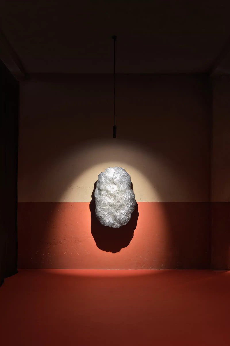
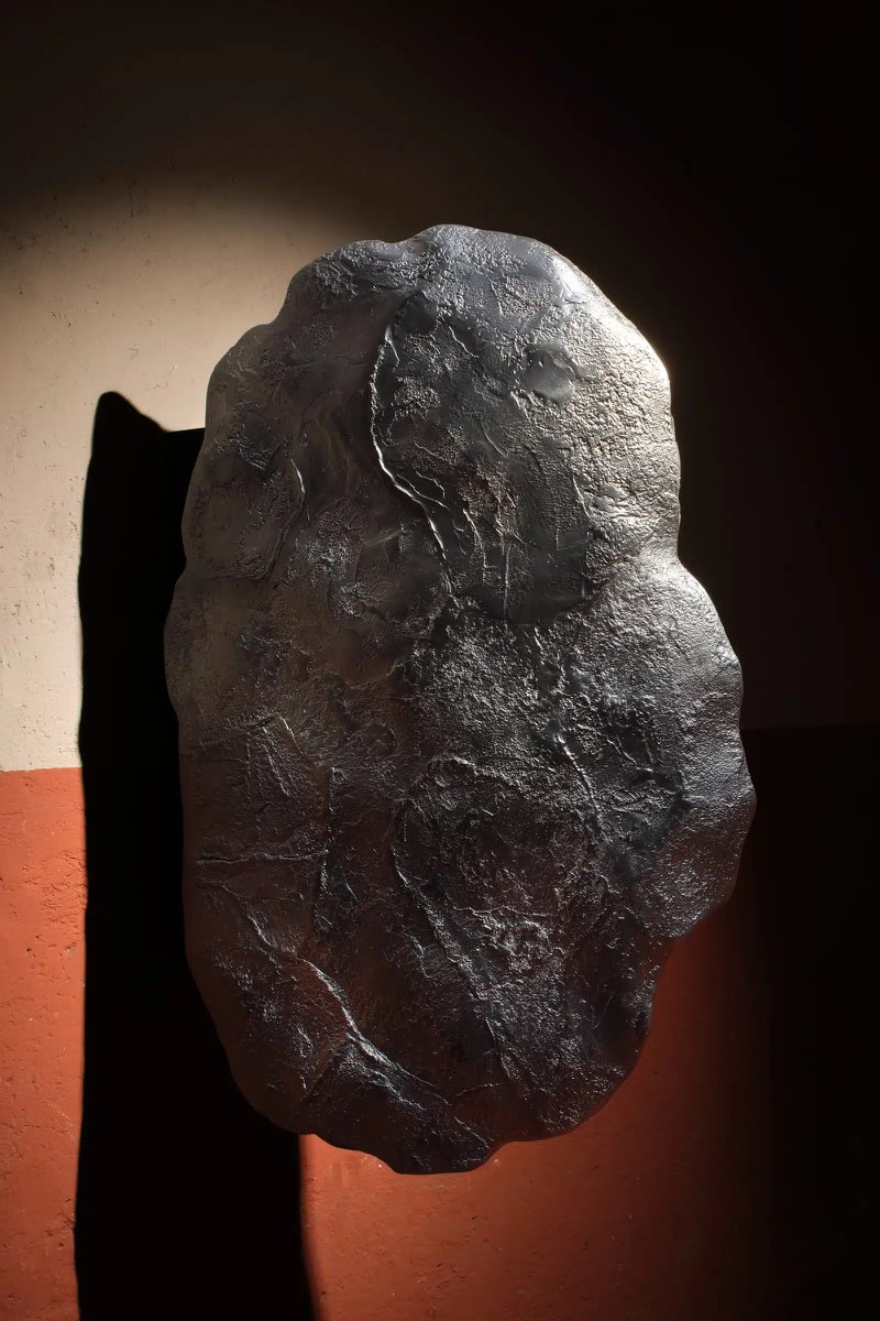
You saw this a lot across Alcova, parts of Convey, Deoron, some of the Isola Design Festival stuff, and especially with 6AM Glass. Objects that didn’t quite resolve into anything familiar. Surfaces looked burnt, stretched, or halfway through a transformation; lamps, chairs and modules that looked alien and/or alive; things that felt like they’d been grown or eroded rather than designed.
At first it reads as material experimentation, which it is, but altogether it gave me a strong sense that this sort of eeriness-as-aesthetic was a major theme. These pieces intentionally made the material – usually glass and metal, but also resins and bio-resins – feel autonomous. By pushing the limits of their processes, they almost always resulted in quasi-organic forms.
6AM Glass’ Over and Over show was a good example of this. Many of the pieces looked almost unstable, like they’d been caught mid-process and were waiting to resolve. Repetition played a big role as the name suggests – forms iterated again and again, each one slightly off, slightly imperfect. On a practical level, this allows you to view the material from different angles, letting you see the interplay of glass and light, but on an emotional level these towering structures and iterating blocks felt almost sinister. (I mean this as a compliment, it was one of my favourite shows.)
A lot of the metal work across Alcova operated similarly. Oxidized surfaces, rough edges, joints that felt intentionally unresolved, like Studio Lugo or Theo Galliakis. Not raw in a naive way, but deliberately pushed past the point of refinement. You get the sense that if you kept going, if you polished it further, you’d lose something essential.
Technomagical Realism and Post-Human Objects
It wasn’t always entirely serious. It worked well in tandem with a sort of playfulness as well, though, with objects like Fenna Kosfeld’s Dweller series, which takes this concept beyond materiality and towards a more zoomorphic or alien lens. This push is particularly visible in the context of collectible design galleries like Nilufar Gallery, Movimento, parts of Dimore Gallery, and certainly at Atelier Kondakji.
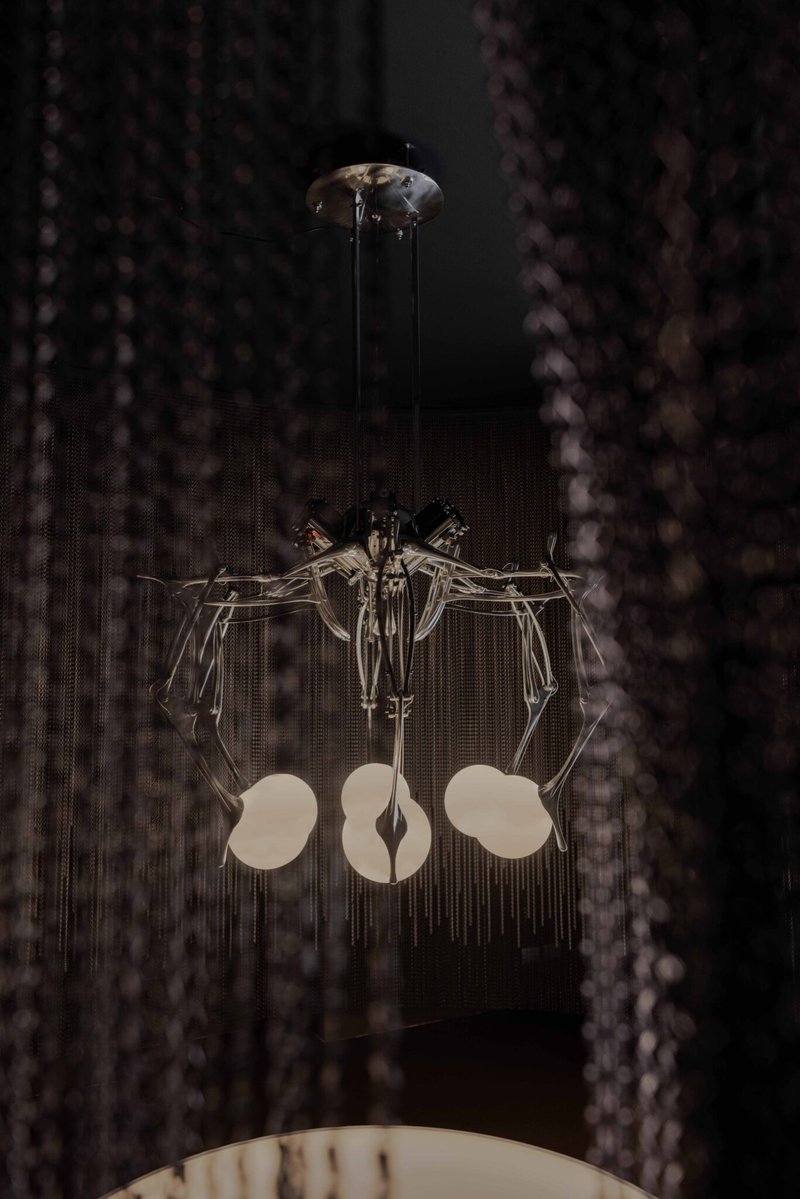
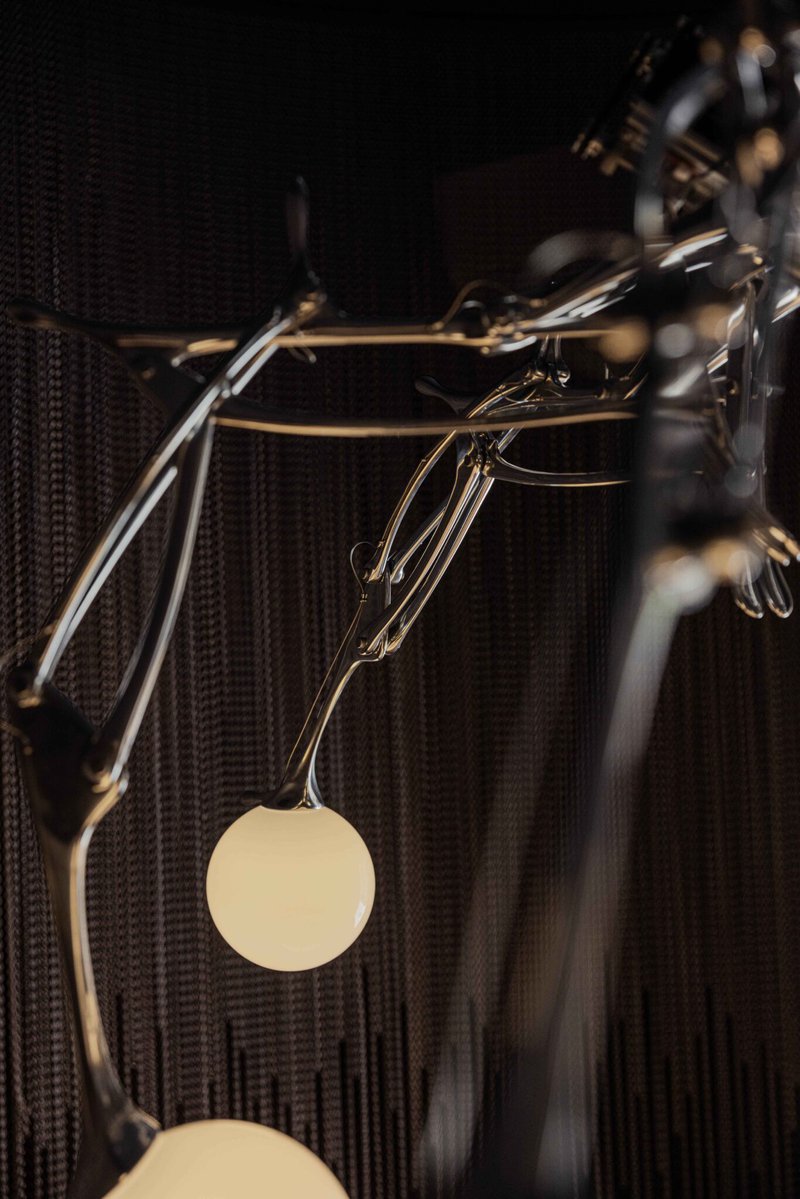
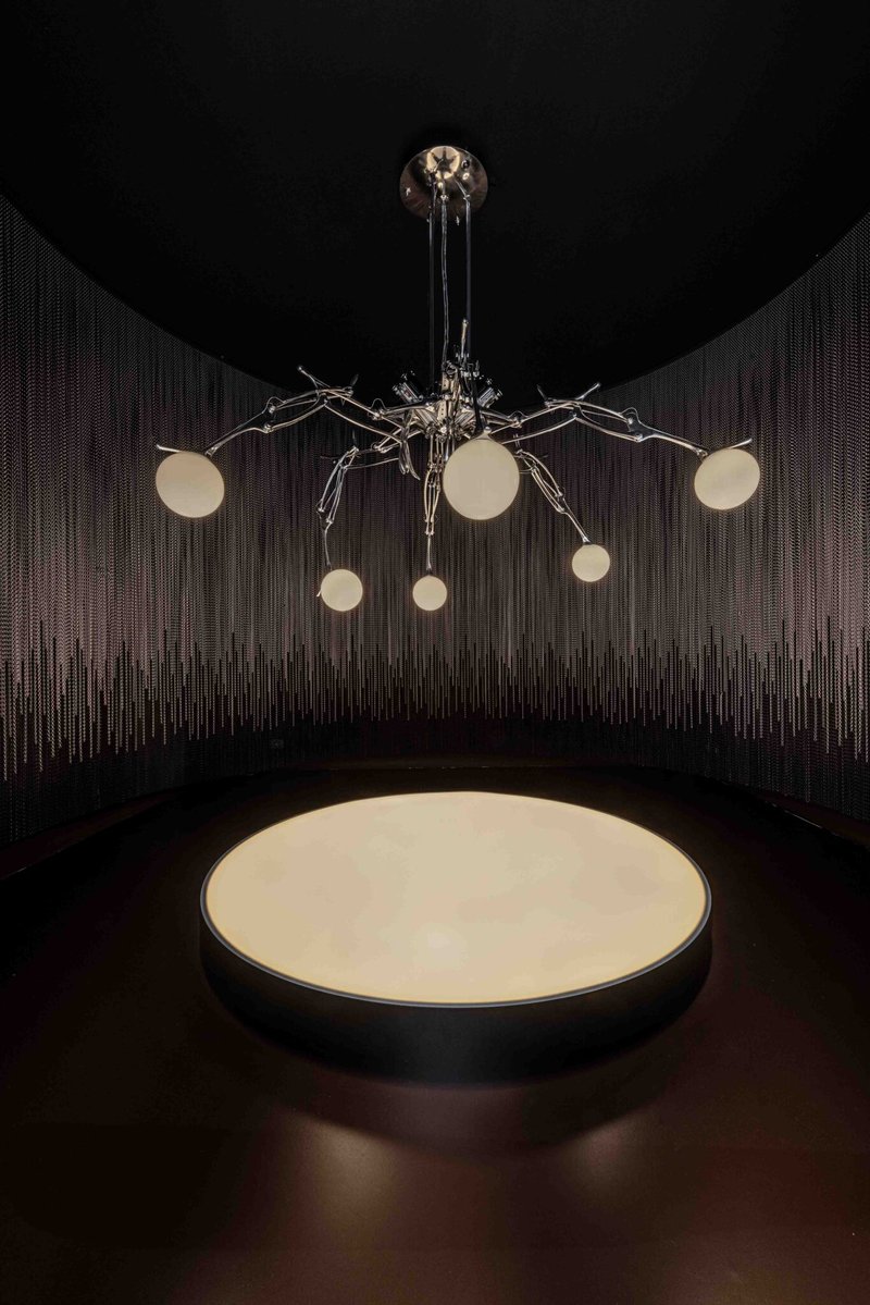
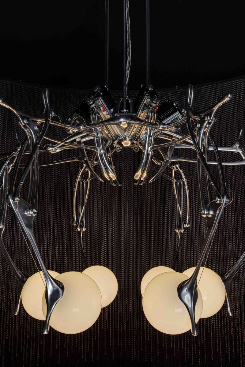
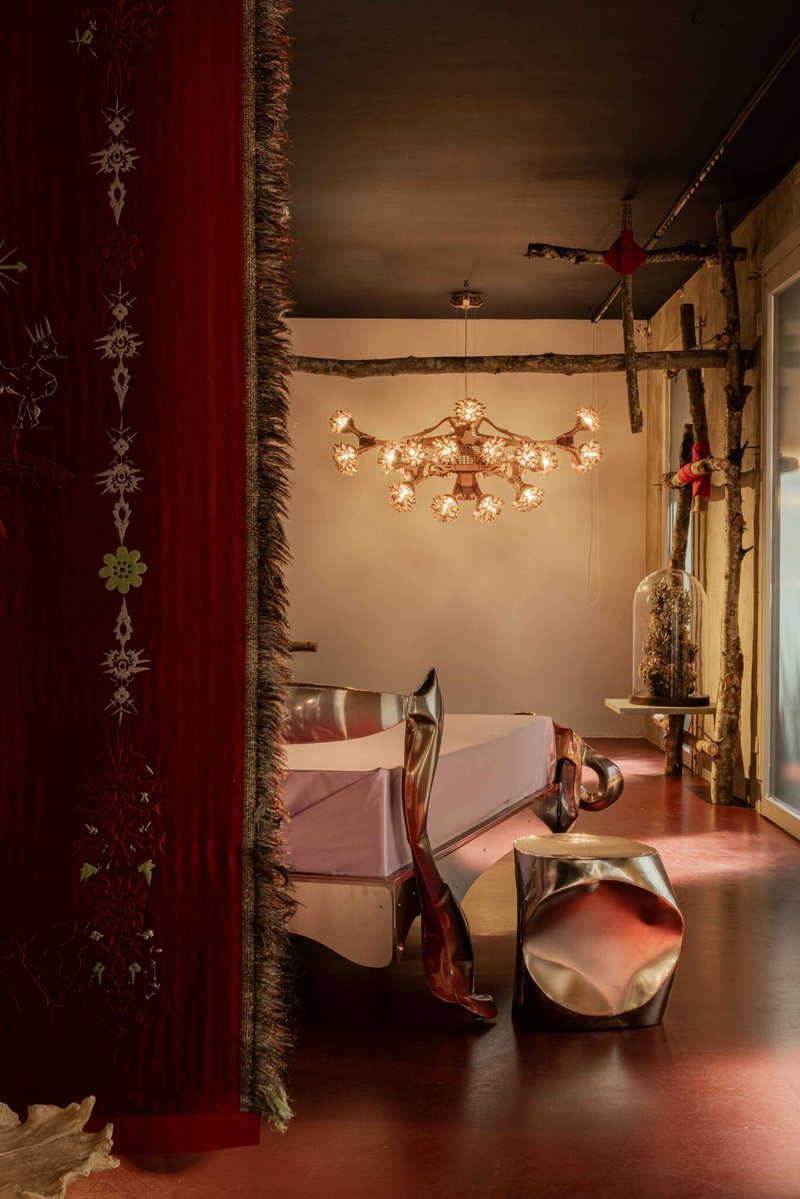
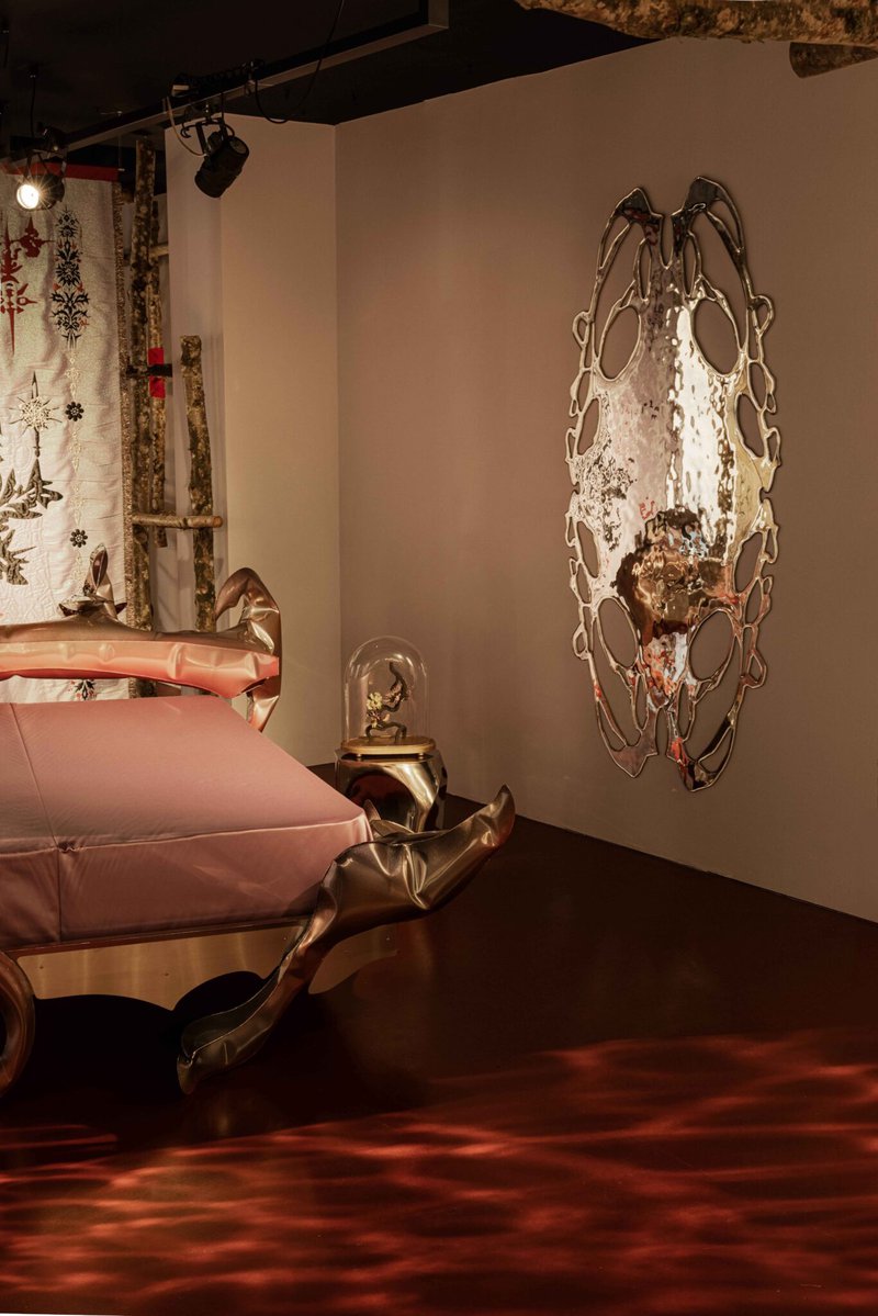
The Nilufar show, La Casa Magica, is probably the clearest example. While the 25sqm space had objects that read as objects, even if slightly eccentric, the whole rest of the show breaks that logic down completely. You walk into what looks like a bedroom, but it doesn’t function like one. Mirrors become liquid surfaces or portals, beds become creatures, and the whole thing feels less like a domestic interior and more like a kind of habitat. A highlight of this show (which was essentially all highlights) was the Lumiac lamp by Andrea Mancuso, a chandelier composed of robotically controlled arms, which moved autonomously, responding to the presence of people in the room with it.

Same with Movimento’s One, Two, Many. The show was structured around themes like eclipse and reduction, which sounds vague until you see how it translates into form. Shelves that read like fragments of meteorites, or lamps that grow out of the ceiling in bamboo-looking tentacles. Everything sits slightly outside of human scale – not in size, but in logic. It creates a slight uncanny about it, but not in a horror way. More like a quiet realization that the object doesn’t need you and perhaps wasn’t made for you at all. It exists on its own terms, within its own system, and you’re just passing through.
That’s where “technomagical realism” starts to feel like a useful way of describing it. Not quite sci-fi, not quite organic, but somewhere in between.
Conclusion: Milan Design Week Is Awesome and Now My Feet Hurt
If anything, this year made it clear that Milan Design Week isn’t moving in one direction. You have total control and refinement on one end, materials slipping out of it on the other, and then all these environments that you don’t really look at so much feel embodied. The variety is kind of the point.
But honestly, the takeaways are only half of it.
The rest is just the week itself: running into people you know, meeting new people, getting dragged to something random that ends up being great. You spend as much time talking about design as you do actually seeing it.
And the more you see and talk about it, the more you realize how much you haven’t seen or heard of. There could easily be three or four more sections here based on stuff I did see, and I still feel like I barely scratched the surface.
By Sunday afternoon, my feet were cooked, my phone was perpetually at 2%, and I needed to sleep so bad. I had also, somehow, just seen a chandelier that moved on its own, a room made of nothing, and a piece of cashmere that almost made me cry. So, fair trade.
For all the lines, the chaos, and the occasional feeling that you’re just speedrunning aesthetics, Milan Design Week still manages to deliver those moments where something actually lands. Also, the drinks being (mostly) free definitely helps.
